一个 通过css实现的loading组件 input组件
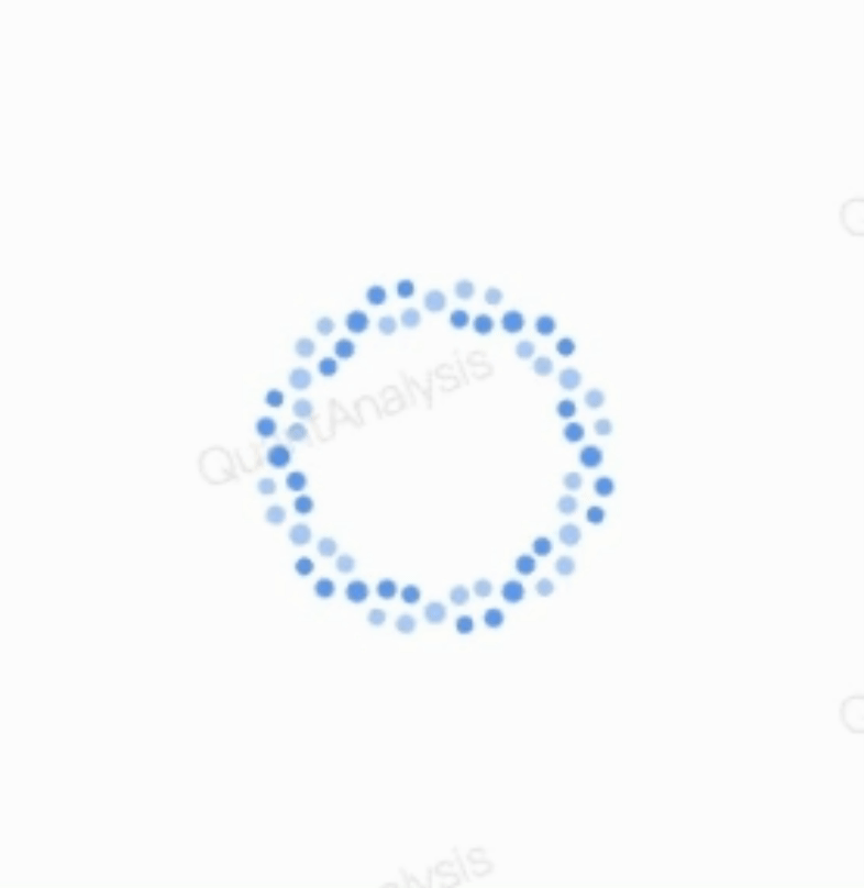
# 图例
# props
- dotNum
- loading 点的数量,默认 36
- dotSize
- loading 点的大小,默认 6px
- size
- loading 的区域大小
- delay
- loading 跳动频率
- loading
- 是否开始 loading
- children
- className
# 实现代码
点击 展开/收起 jsx 代码
/**
 * @des 简单的 loading 组件
 */

import React from 'react';
import * as _ from 'lodash';
import classNames from 'classnames';
import './Spin.scss';

const Spin = ({
  dotNum = 36,
  dotSize = 6,
  size = 100,
  delay = 1500,
  loading,
  children,
  className,
}) => {
  return (
    <div className={classNames('custom-spin', className)}>
      {children}
      {loading && (
        <div className="custom-spin-loading">
          {new Array(dotNum).fill(0).map((v, i) => (
            <div
              key={i}
              className="dot-item"
              style={{
                width: dotSize,
                height: dotSize,
                marginLeft: -dotSize / 2,
                marginTop: -dotSize / 2,
                transform: `rotate(${(i * 360) / dotNum}deg) translateY(${
                  size / 2
                }px)`,
              }}
            >
              <div
                className="before"
                style={{
                  animation: `blackMove ${delay}ms infinite`,
                  animationDelay: `-${(i * 6 * delay) / dotNum}ms`,
                }}
              />
              <div
                className="after"
                style={{
                  animation: `whiteMove ${delay}ms infinite`,
                  animationDelay: `-${(i * 6 * delay) / dotNum}ms`,
                }}
              />
            </div>
          ))}
        </div>
      )}
    </div>
  );
};

export default Spin;
点击 展开/收起 jsx 代码
$ballSize: 10px; //小球的大小

.custom-spin {
  position: relative;
  width: 100%;
  height: 100%;

  .custom-spin-loading {
    position: absolute;
    top: 0;
    left: 0;
    width: 100%;
    height: 100%;

    .dot-item {
      background-color: transparent;
      position: absolute;
      left: 50%;
      top: 50%;
      perspective: 70px;
      transform-style: preserve-3d;

      .before,
      .after {
        width: 100%;
        height: 100%;
        position: absolute;
        border-radius: 50%;
        content: '';
      }

      .before {
        background-color: var(--blue-press-1);
        top: -100%;
      }

      .after {
        background-color: var(--blue-press-2);
        top: 100%;
      }

      @keyframes blackMove {
        0% {
          animation-timing-function: ease-in;
        }
        13% {
          transform: translate3d(0, 50%, calc(#{$ballSize} / 2));
          animation-timing-function: ease-in;
        }
        25% {
          transform: translate3d(0, 100%, $ballSize);
          animation-timing-function: ease-out;
        }
        38% {
          transform: translate3d(0, 150%, calc(#{$ballSize} / 2));
          animation-timing-function: ease-out;
        }
        50% {
          transform: translate3d(0, 200%, 0);
          animation-timing-function: ease-in;
        }
        63% {
          transform: translate3d(0, 150%, -calc(#{$ballSize} / 2));
          animation-timing-function: ease-in;
        }
        75% {
          transform: translate3d(0, 100%, -$ballSize);
          animation-timing-function: ease-out;
        }
      }

      @keyframes whiteMove {
        0% {
          animation-timing-function: ease-in;
        }
        13% {
          transform: translate3d(0, -50%, -calc(#{$ballSize} / 2));
          animation-timing-function: ease-in;
        }
        25% {
          transform: translate3d(0, -100%, -$ballSize);
          animation-timing-function: ease-out;
        }
        38% {
          transform: translate3d(0, -150%, -calc(#{$ballSize} / 2));
          animation-timing-function: ease-out;
        }
        50% {
          transform: translate3d(0, -200%, 0);
          animation-timing-function: ease-in;
        }
        63% {
          transform: translate3d(0, -150%, calc(#{$ballSize} / 2));
          animation-timing-function: ease-in;
        }
        75% {
          transform: translate3d(0, -100%, $ballSize);
          animation-timing-function: ease-out;
        }
      }
    }
  }
}